When I was mapping my site, I looked to my vision board as there is a clear aesthetic that I can draw inspiration from. There were two things I knew for sure: I wanted browns, and I wanted my main font to have serifs. I think I am closer to achieving it, but there’s still more work to be done in order to get the exact website I have in mind.
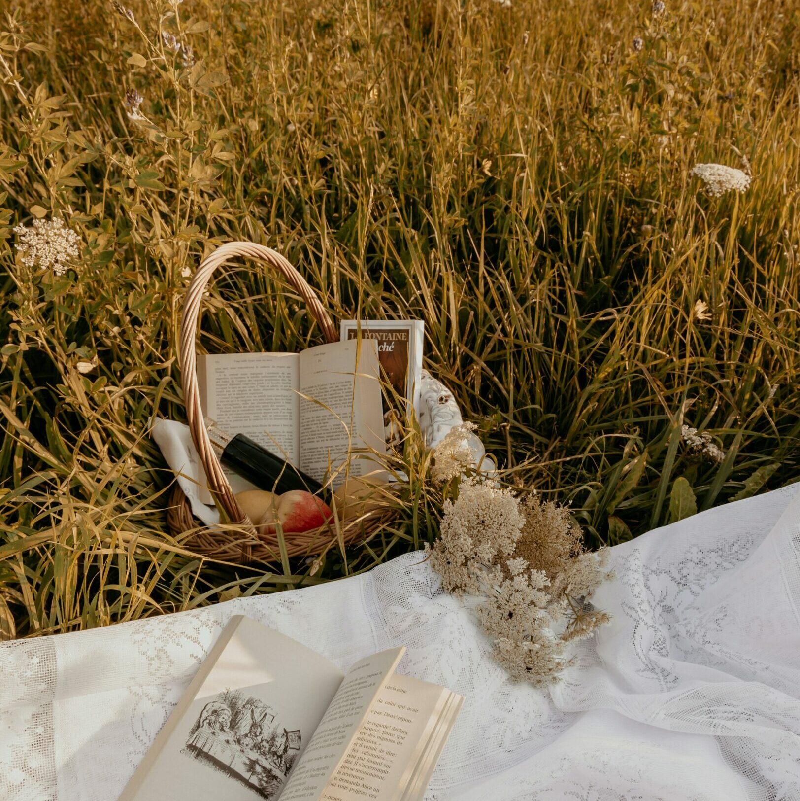
When the website is first loaded, I made sure to have it open to the home page. On the home page, I have a brief introduction/summary of the website, and an image that I think summarizes the book theme. Underneath, I have all my recent posts.
In the navigation bar, I put “Blogs” first, since that would be what draws people to the site. Furthermore, I broke it down into two main categories (for now): reviews and recommendations.
Third, is my Posiel category. I have 3 categories sub-listed under it, organized by most frequent to least frequent. From the top to bottom: process posts, mini-assignments, and peer reviews.
Lastly, I put my “About” page at the end because other websites usually have their contact and about information at the end.